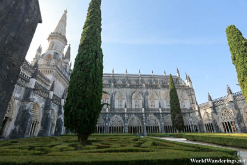
I was very impressed with the design of the Monastery of Batalha. This is quite different from the previous monastery which visited. Although both were designed as gothic churches, the monastery at Batalha has far more elaborate designs compared to the former. I was struck at how different it actually was. The monastery of Batalha was built as a thanksgiving for the victory of the Portuguese over the Castillians, perhaps it was only fitting that only the most beautiful designs were used in this structure. This is not limited to the church but also the rooms inside. The monastery was built up over time, passing through the reign of seven kings.
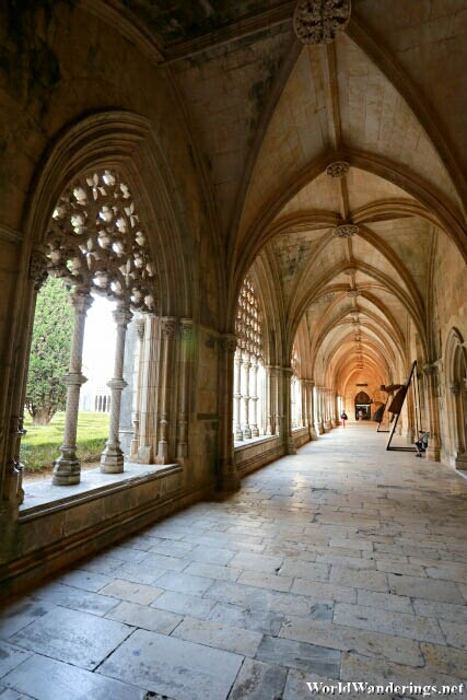
Since the construction spanned the reign of seven kings, it is natural that there would be differences in the design as a new king comes. Actually, it was the architects which seemed to have a field day here incorporating flamboyant gothic and the Manueline style into various parts of the monastery. The Royal Cloister of the monastery is an impressive example of this mixture of styles. The cloister was actually not part of the original plan, but it was inserted by the succeeding architects. The pillars and arches by the cloister have very elaborate designs typical of gothic design, perhaps even more elaborate than normal. In between the pillars are curtain like screens of Manuelline design which is typical design at the time. The result is one of the most impressive cloisters I have visited.
[xmlgm {http://www.worldwanderings.net/kml/BatalhaMonastery.kmz} zoom=19]

